How can I adapt my drawing process(es) and techniques to be more effective/efficient?
During and after creating the drawing of the beach from the 2nd Free Inquiry post, I became… encouraged by the long amount of time it took to try to find a more longevity protecting way to create as to not burn out (or take a million years); prompting me to explore the different styles. Looking into different styles and techniques, and their benefits and tricky points, and if they could apply to future teaching. As well as to see if a style would either work for me, or if I could learn something to help my lack of time control.
The Pineapple Portrayals
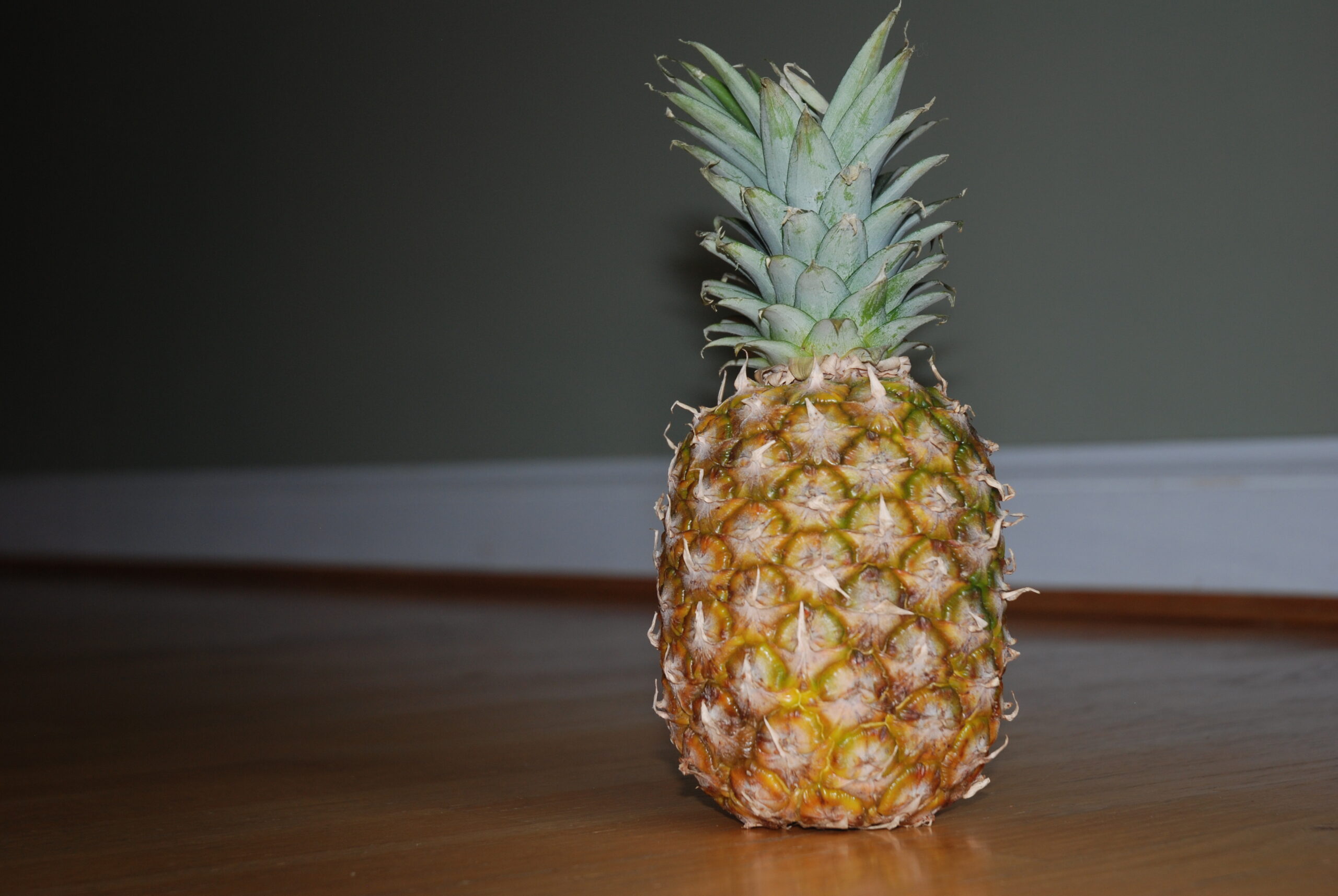
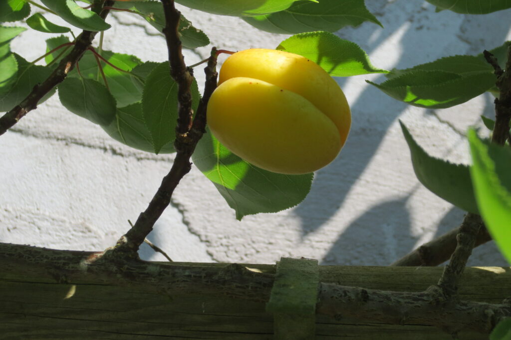
This begins the exploration of a pineapple; drawing the same pineapple over and over again in different styles/techniques. Why a pineapple one may ask, no clue, it was on the counter and I needed an object. To keep on track of the efficiency and my progress I will (try to) time the drawings. This could this be adapted into a project for future students, observing the world and discovering different ways to interpret into their art, possibly recorded in some form of observation journal.
Photo Process
I had some unexpected challenges with this expedition of photo taking. Before even taking any photos the SD card that I was using spontaneously stopped working and came up with the alert on the camera that it needed to be formatted, and the computer not recognizing it/any of the files. We (my mum and myself, it is her camera and computer after all) still have yet to figure it out, which is sad as a lot of photos from my childhood are on it. So we bought another card, however, this card also did not work, leaving me at a loss. Thus, started the search for a solution, then remembering we have more cameras, began the hope that we forgot to remove the card from one. Success! The card worked, and I even rediscovered photos I took in the summer and had forgotten about (shown at the end of this post).
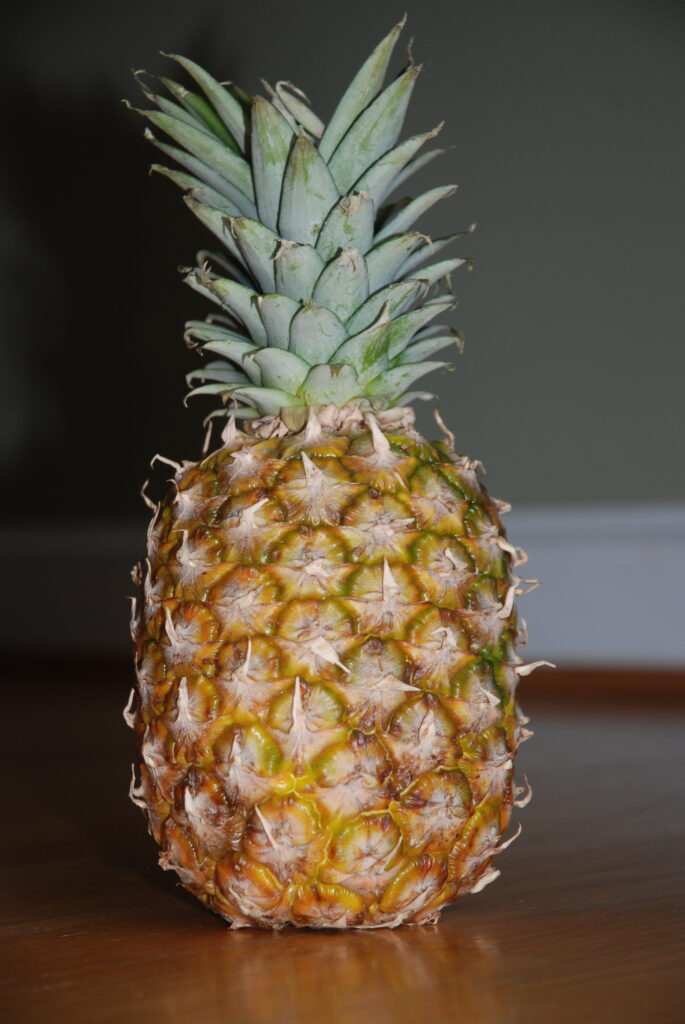
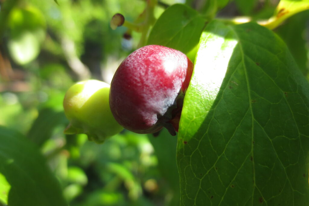
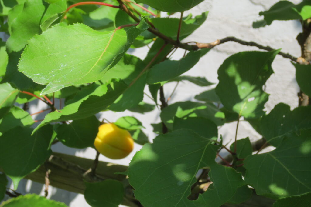
This pineapple photo will provide the reference for the various styles, never before have I draw so many pineapples consecutively.
Typography
Typography is the art and technique of arranging type to make written language legible, readable, and visually appealing. This can demonstrate emotion and concepts, and emphasizes different aspects to help visualize importance or meaning. (I used the hand-lettering portion of typography)
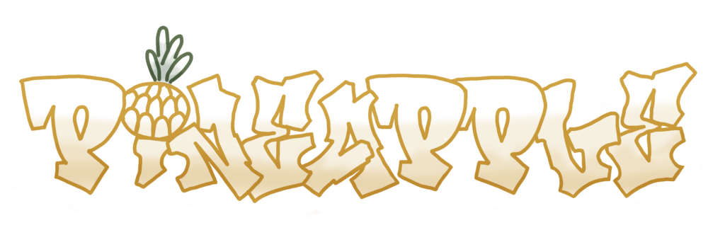
This font is from/inspired by the graffiti nature of the hip hop lesson, as well as wanting to try something different (other than my usual style, reminiscent of cursive, and demonstrated in “space” in the graphic above). On the reference font I used, the dot of the “i” was a smiley face, the pineapple was a cute touch.
Flat & Monochrome
Flat design: This is a style of graphic art that uses simple, two-dimensional elements and bright colors. There is no use of gradients, shadows, or three-dimensional effects, giving it a clean and minimalist look. Think of it as a very straightforward, no-fuss approach to design.
Monochrome: This term refers to a color scheme that consists of different shades of a single color. It can create a cohesive and harmonious look by using only variations in lightness and saturation of one color. For example, a monochrome design might use various shades of gray, from black to white, to create depth and interest without introducing additional colors.
These styles, combined, are a good tool for teaching and in many cross curricular connections. Using flat and monochrome for graphics is beneficial
- Graphics created are straightforward and easy to understand. By only including necessary aspects students are less likely to get confused or distracted.
- Monochrome colour schemes help maintain a clear focus on the content, again highlighting only essential information.
- Flat and monochrome designs can be adapted to various subjects and educational materials, making them a versatile choice for teaching. Whether it’s for diagrams, illustrations, or infographics, this style can be applied and adapted across different topics and grade levels.
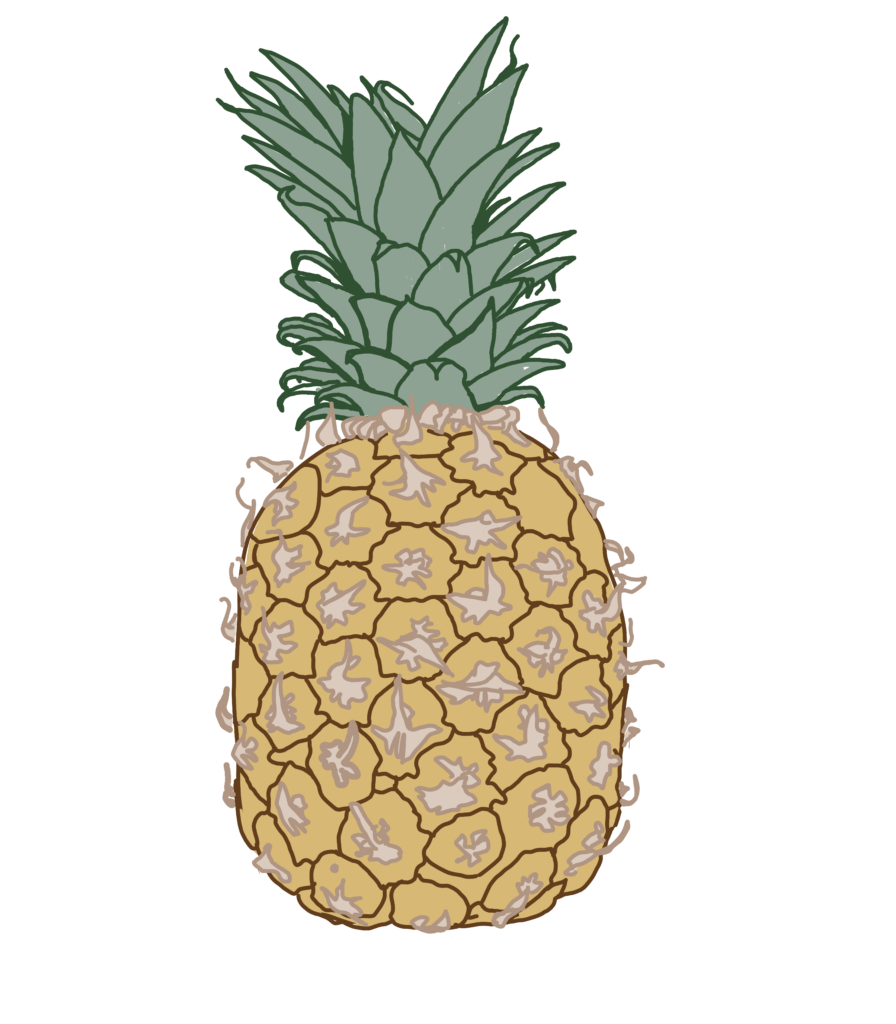
This style was relatively easy, picking three different colours and a corresponding darker outline, then tracing shapes and filling them in from a behind layer (as to not interfere with the outlines). I was hoping to aim for 30min, it took 40.
Pencil Sketch
A digital pencil sketch mimics the look and feel of traditional pencil sketches. The process involves using various brushes and settings that simulate the texture and shading techniques of a real pencil.
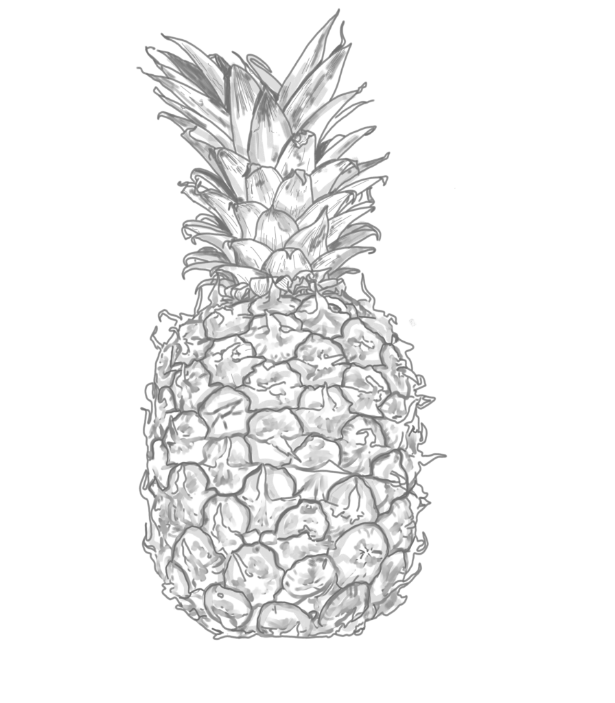
This drawing took about an hour. (The image below is my progress at the half hour mark, details take time).
I went into this doodle with the idea that pencil sketching would likely take more time due to the ability to add more detail, however, the lack of colour cutting off some time. I was fairly correct.
While doing this sketch I had to re-do it 3 times, as the first two attempts somehow removed my paint layer so I was directly sketching on the image, prompting a restart.
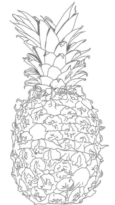
Line Art/Monoline
Both monoline and line art involve using line(s) to create artwork and is adaptable for any skill level and personal, thus is more accessible. From the wide variety of sub methods of easier to take creative liberties and adding as much or as little detail as one would want (line art leaning more towards more detail, and monoline needing more interpretation).
Line art: This a broad term that describes any artwork created using distinct lines. Focusing on the use of lines to define shapes, contours, and details, often with minimal or no shading and colour. Artworks can consist of various line thickness and ranges from simple and clean to detailed and expressive. Students can explore the different sub styles (including monoline) and techniques to convey ideas cross circularly and emotions and depth in their artwork.

Monoline: This style uses a single line (or a few lines) of equal thickness for, creating a simplified and minimalist look. This technique creates a clean, cohesive look and can be used to create intricate patterns, logos, illustrations, and hand-lettering. The minimalistic aspect allows for a simple, cohesive, and uniform look. However, limiting depth, as well as the creation requiring thoughtful line placement so interpretation is clear. Often this style is used for hand-lettering, graphic designs and logos; as a project idea, students could create their own logos, possibly connecting to a business unit (math?) or an identity unit.


These two took roughly 3 minutes each (of actual drawing time, not the misfires), and show some of the variations this style my produce.
Pixel
Pixel art is a form of digital art where images are created and edited at the pixel level. Artists use software with a grid-based interface to place individual pixels, building up the image pixel by pixel. This technique often results in a retro, 8-bit or 16-bit aesthetic reminiscent of early computer and video game graphics. (Adaptable into a project).
Pixel art would foster interpretations due to the limit of detail one can include, as well as the pixel-by-pixel approach requiring careful planning and problem-solving, helping students develop critical thinking skills.
This pixel-ing technique could be a good tool to sensor student’s faces.
I used a brush that turned an image into pixels for this drawing (cheating? maybe. A use of a tool? Yes!). I at first started with a canvas size the same as the others (7000 by 8000), then soon realized that the brush size was small and it would have taken forever, so I make the canvas 700 by 800, which worked well. It took around 20 minutes (once starting on the smaller canvas), with the process I first erased the excess of the photo I would not use, then used the brush over the whole pineapple, and finally erased the edges with the pixel brush.
Without a brush that did it for me this would have taken a good long while to complete.
Watercolour
Digital watercolour art is a form of digital painting that mimics the look and feel of traditional watercolour techniques. This creates artworks that resemble the fluid, translucent, and layered effects of watercolour. The digital medium allows for control over brush settings, water flow, and blending, providing a similar experience to painting with real watercolours.
Physical watercolours are an amazing school tool; being small and compact, easy to clean, generally non-toxic, relatively inexpensive, and a mindful nature. So a digitized version would provide a different mode to a similar result, allowing for when a situation or student cannot accommodate the traditional method (same applying to digital art in general).
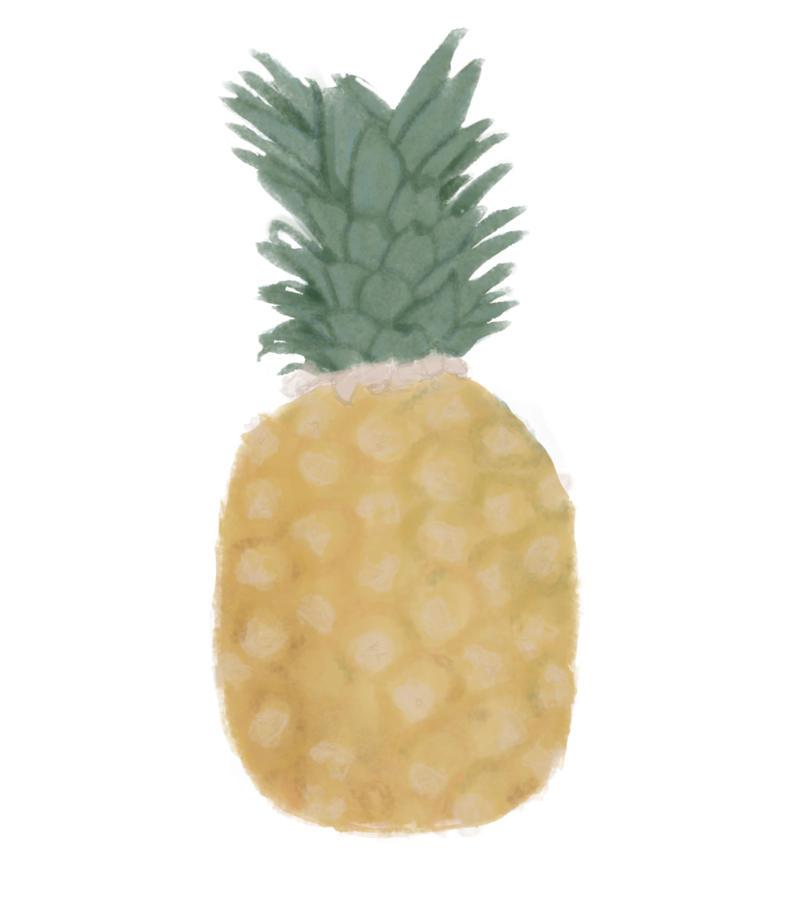
Took an hour, however, was sleepy so that may have effected time. I do like the leaves, pineapples are odd!
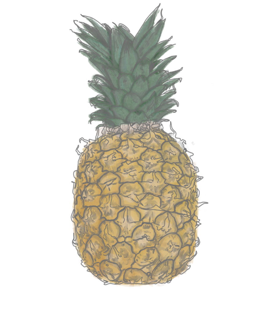
What I would normally do is use the pencil sketch style mixed with watercolor. Though this may be a part of my problem, both of them being the more time consuming techniques I experimented with.
(I layered the 2 on top of each other to test this, yes, I approve).
A Summer Savior Spectacle


Resources/References
- Art Canada Institute
- The Great’s
- Don Corgi
- Shutterstock
- Icon packs (e.g. PowerPoint)
Sorry, but comments are not enabled on this site.